PORTFOLIO / WORK

PROJECT BISOTON
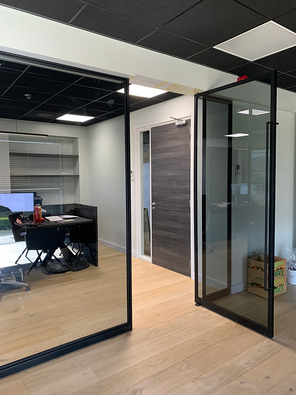
As one of my first assignments in project design that I designed independently, this was a challenge. For the company Bisoton in Ede, the Netherlands, I was asked to provide a new interior with as little budget as possible and as much existing furniture as possible. Here, the main emphasis is on the new use of colors on the walls and what text can do to the mood in the workplace. The entrance now makes a big impression and made, a relatively boring part, the wardrobe, fun for the eyes. In the leisure area, which is also the canteen, words have been played with. ''Concrete and to the point'' refers to the concrete they literally work with and what they are like as a company.
A challenge I had to deal with, was that in the process of delivering the design, I suddenly was dragged into a collaboration with a furniture maker. As he was pulled in by the company owner himself. Suddenly there was a lot of budget again and my original design got mixed up with new designs in which I wanted no part in. Luckily I made my part very clear and that made that I didn't have to change or do extra work.
VISUALIZATIONS


WORK IN PROGRESS